




An injured person lands on a law firm's home page from a Google search, an ad or a friend's text, on a phone, often at night, and decides in a few seconds whether to keep reading. Everything the firm spent getting them there is decided in that moment. So instead of describing what a good injury site looks like, this article shows ten of them: screenshotted on the same day in October 2026, above the fold on a desktop, and scored on the ten things that we have measured to move conversion across 400 landing pages and the injury accounts we run.
The sites are the national brands and strongest boutiques in each market, chosen because they rank and spend. None of them is a client of ours. The scoring is what we would do to any firm's site in the first hour of a conversion audit; the firms named here are simply the ones doing it in public.
Key Takeaways
- The US firms put the enquiry form in the hero. The Australian national brands put a modal in front of the hero. Two of the three largest Australian injury firms interrupt the first visit with a "select your state" box before a visitor has read a word.
- The best page in the set is a Queensland boutique. Real client photo, a specific promise, a two-minute claim check, no cost stated, and the form visible on the first scroll: six of the ten criteria met before the fold.
- Reviews above the fold are rarer than they should be. Three of ten show a rating in the hero. Our own tests found moving testimonials below the fold measurably cut conversion on injury pages.
- Nobody states the first step. Not one of the ten tells the visitor what happens after they fill in the form. It is the single cheapest fix on the list.
- Copy the specific, not the big. A mid-sized firm cannot be "America's largest" or run a chat assistant; it can show the lawyer's face, name the claim types, state the fee position and put the form where the visitor is looking.
The scorecard
Ten criteria, each worth one point, scored on what is visible above the fold on a 1,568-pixel desktop viewport. These are the elements we have seen move conversion on injury pages, in the order they tend to matter.
| # | Criterion | Why it matters for an injured visitor |
|---|---|---|
| 1 | Headline names the problem or the claim type, not the firm | The visitor checks they are in the right place in under a second |
| 2 | Primary call to action is a free, low-commitment first step, visible without scrolling | "Free claim check" outperforms "Contact us" on every injury page we have tested |
| 3 | Form or phone number above the fold | Most injury traffic is mobile and outside hours |
| 4 | Fee position stated (no win no fee or equivalent) | The fear of an open-ended bill is the main reason injured people delay calling |
| 5 | A real person, not a stock photo | The visitor is about to tell a stranger the worst thing that has happened to them |
| 6 | Reviews or rating visible | Injured people check reviews more than any other legal client |
| 7 | Claim types visible as navigation or cards | The visitor searches by scheme, not by "personal injury" |
| 8 | Credibility specific to injury work (awards, results where permitted, years, cases) | Differentiates from the directory listings above you in search |
| 9 | What happens next is stated | Reduces the perceived commitment of the first contact |
| 10 | No interruption before the content (no modal, no cookie wall, no chat pop) | Every interruption costs a share of visitors who were about to read |
Australia
Shine Lawyers
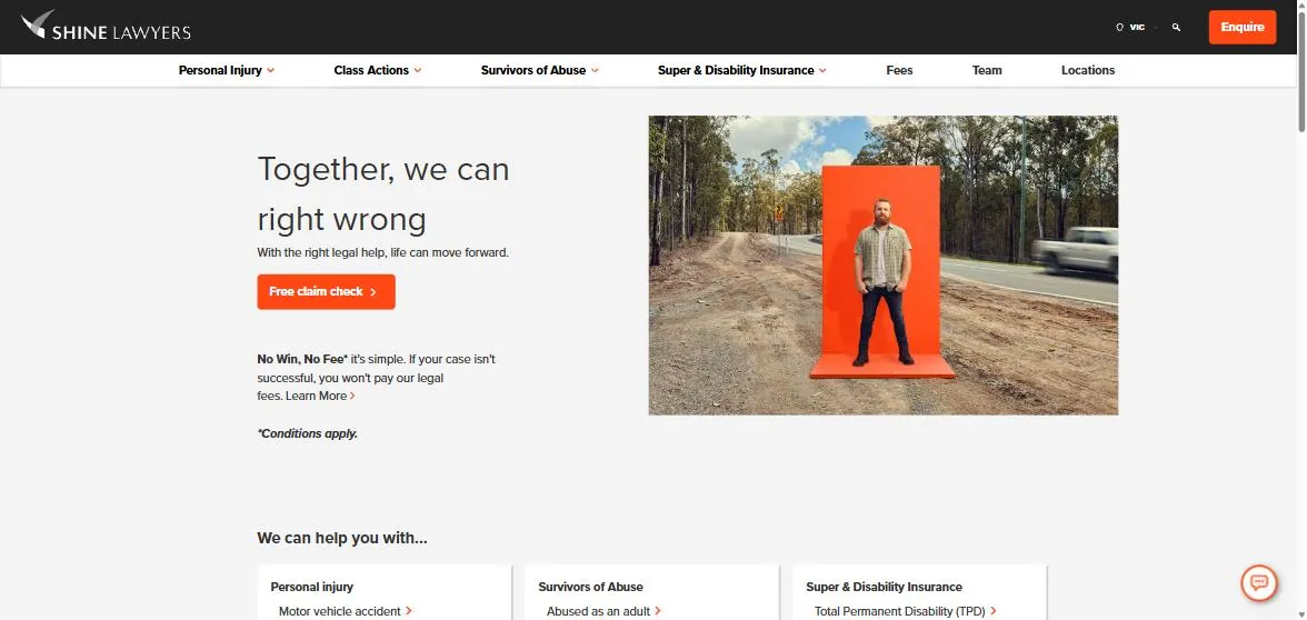
Score 6/10. The strongest Australian national brand page in the set.
The headline is brand voice rather than a problem statement, but everything under it is right: "Free claim check" as the only button, no win no fee stated with the asterisk honestly placed, claim types in the navigation and in cards immediately below, and a photograph that is clearly a real person. No reviews above the fold, no statement of what happens after the claim check, and the headline would convert better if it said what the firm does for whom.
Law Partners
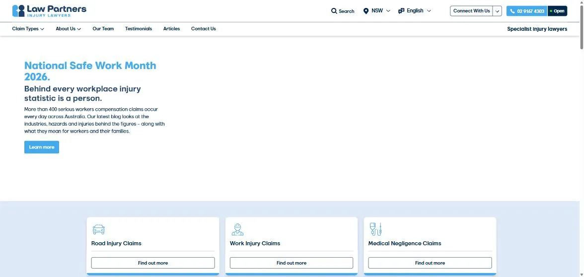
Score 6/10. The best headline in the Australian set, undermined by the hero rotating to a blog promotion.
"Injured? We'll help make it right" names the problem in the first word. The Google rating is in the hero, the claim types are cards directly beneath, the phone number shows open status. Two faults. There is no form and no button in the hero at all, the visitor has to find the phone number in the header or scroll to a card. And the hero is a carousel: on the second load it showed a National Safe Work Month blog promotion instead of the offer. That happens when the marketing team owns the home page and nobody measures it.
Maurice Blackburn
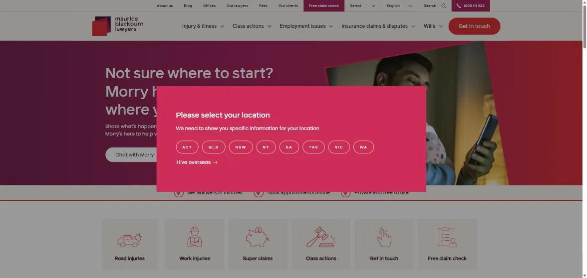
What the first visit shows: a state selector before the page.
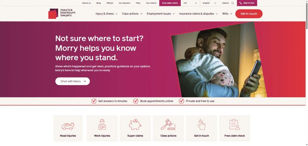
Score 4/10. The page behind the modal is well built; the modal costs it.
Behind the picker is a confident page: a headline that speaks to the visitor's state of mind, a chat assistant as the primary action, a trust strip and six claim-type icons. The problems are the modal, which every visitor hits before reading anything, and the chat as the only above-the-fold action, which asks an injured person to start typing to a bot before a phone number or form is offered. There is a reason the two largest firms in the country gate by state: the law differs, and they want to show the right scheme. A smaller firm serving one state does not have the problem and should not copy the solution.
Slater and Gordon
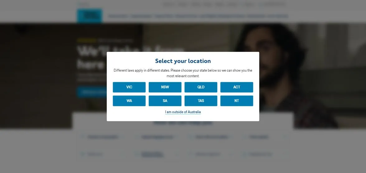
Score 3/10 above the fold, because the fold is a modal.
Same pattern, heavier execution: the picker is the page until a state is chosen, and the content behind it is blurred. On a phone this is a full-screen interstitial on first visit. The page behind it carries a real client photo and a clear "we'll take it from here" promise, but criterion 10 exists because this costs real enquiries, and a firm this size can measure exactly how many.
Smith's Lawyers (Queensland)
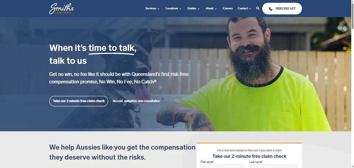
Score 8/10. The best page in the set, from a boutique operating under the strictest advertising rules in the country.
A real client in a hi-vis shirt with his dog, which tells a Queensland worker everything about who this firm acts for. A promise that is specific and owned ("No Win, No Fee, No Catch"). A single primary action with a time attached ("Take our 2 minute free claim check") and the cost stated beside it ("No cost, obligation-free consultation"). Phone number top right. The form itself is visible on the first scroll, with the heading repeated so the visitor knows it is the same thing. Reviews are the one missing element above the fold, and the page does not say what happens after the claim check. Everything else is a model for a mid-sized firm, and it is done inside Queensland's PIPA restrictions, which our guide to personal injury advertising in Queensland covers.
United States
Morgan and Morgan
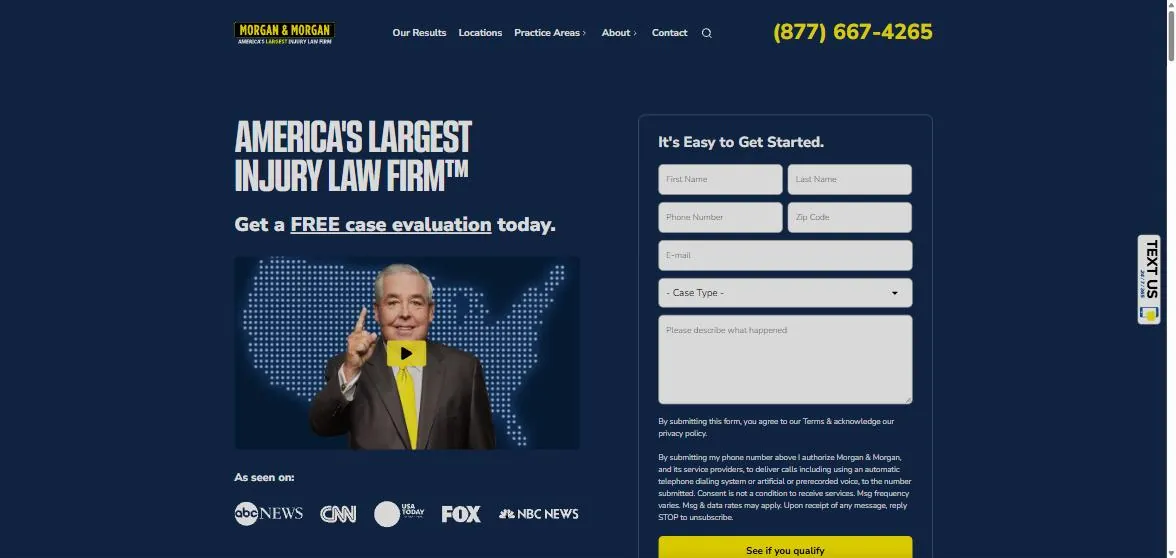
Score 7/10. The template every US injury page copies, for good reason.
Headline is the brand claim, which the firm has earned. The form is the hero: six fields including case type and a description box, the consent text beneath it, and "See if you qualify" as the button, which turns a form into a screening step. Founder video with a play button, media logos, a text-us tab on the right edge. No reviews above the fold, no fee statement visible, and the consent block is long enough that on mobile the button sits below the first screen. A mid-sized firm should copy the form-in-hero and the "see if you qualify" framing and ignore the rest.
Sweet James
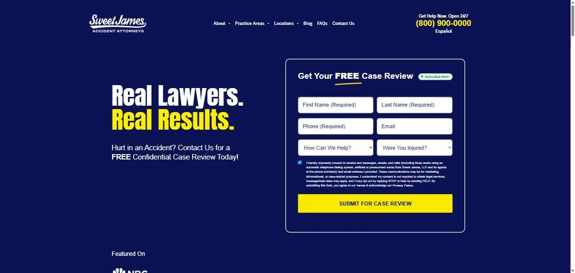
Score 6/10. A clean form-first page with a headline that says nothing.
"Real Lawyers. Real Results." is a claim against an unstated competitor. The subhead does the work: "Hurt in an accident? Contact us for a free confidential case review." The form is the hero with two screening dropdowns, a pre-ticked consent box and one yellow button; the phone number carries "Open 24/7" and a Spanish option. No person, no reviews, no claim types above the fold, and no fee position. The screening dropdowns are the thing to take: "How can we help?" and "Were you injured?" filter at the form, which is cheaper than filtering on the phone.
The Barnes Firm
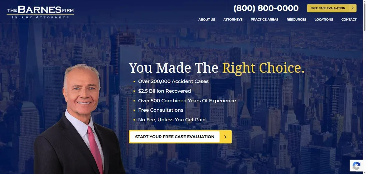
Score 6/10. Proof-led, with the founder front and centre.
The headline assumes the decision is made, which is an interesting choice; the five bullets beneath it do the persuading: cases, dollars recovered, years, free consultations, no fee unless paid. One button, phone number large in the header, the founder's photograph as the image. No form above the fold, no reviews, no claim types. In Australia the "$2.5 billion recovered" line is not available in most states, the main reason US templates do not transfer; the structure of the bullets does.
United Kingdom
Irwin Mitchell
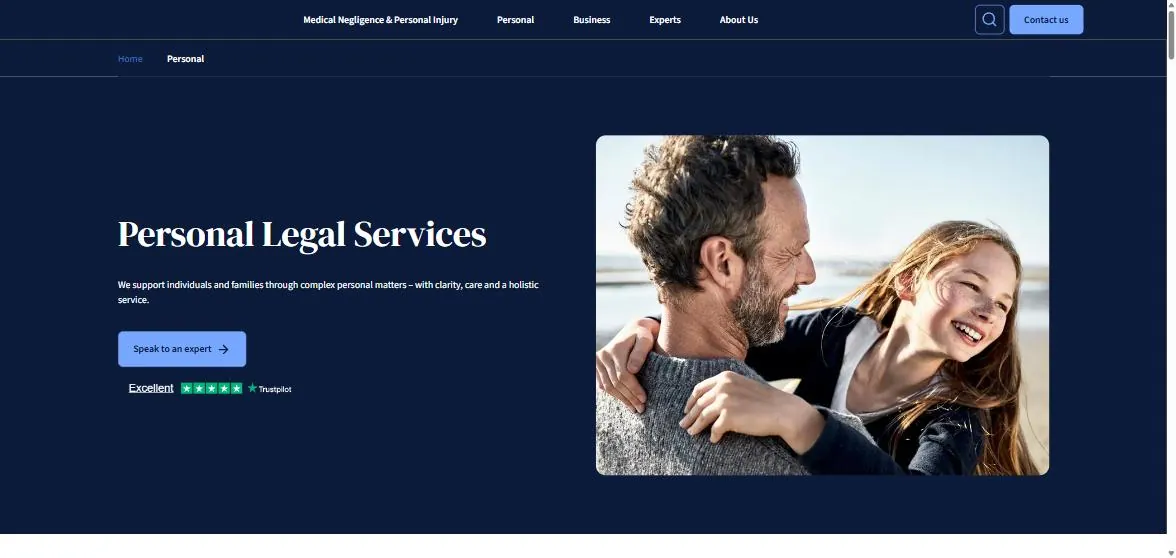
Score 4/10. A corporate page for a firm that does far more than injury.
Irwin Mitchell is a full-service firm and the personal page reflects it: a generic headline, "Speak to an expert" as the action, a Trustpilot rating, a stock-style family photograph. Injury is the first navigation item and nothing else above the fold says injury. The lesson is for multi-practice firms: the injury visitor needs an injury page, and if the home page cannot be that page, the ad and the search listing should land on the practice page instead.
Slater and Gordon UK
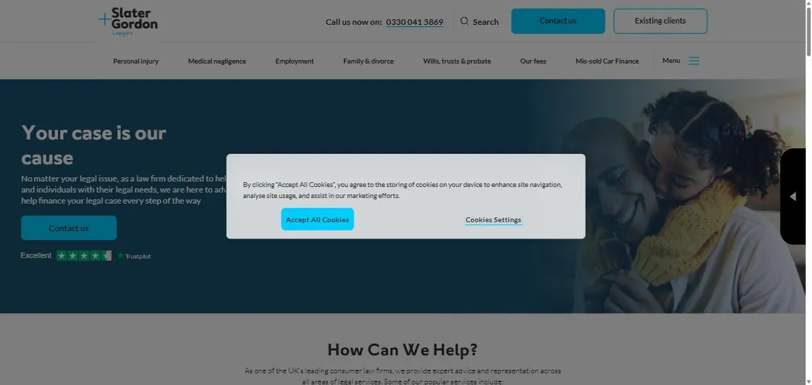
Score 4/10. A cookie wall where the offer should be.
The UK version of the same brand replaces the state picker with a cookie banner that sits over the hero on first visit, which UK law makes hard to avoid and most UK firms handle with a slim bar rather than a centred modal. Behind it: a brand headline, "Contact us" as the only action, a Trustpilot rating in the hero, and personal injury first in the navigation. No fee position, no person who is obviously a client or a lawyer, no form.
Thompsons Solicitors
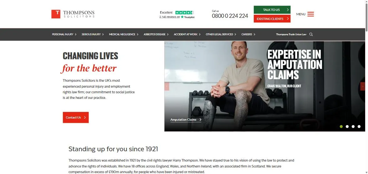
Score 6/10. The strongest UK page in the set, because it shows a client.
A real client, named, in a gym, with the claim type he was helped with. Trustpilot with the review count in the header. Phone number, two buttons, and a navigation bar that is entirely claim types. The headline is brand voice and the hero is a carousel, with the same risk as Law Partners. No form above the fold and no fee position visible, though the UK's conditional fee rules make the second harder to state in one line.
What the ten pages have in common, and where they split
| Criterion | Met by | Pattern |
|---|---|---|
| Problem-first headline | 2 of 10 | Most lead with brand voice; the two that lead with the visitor's situation are a national firm and a boutique |
| Low-commitment free first step | 8 of 10 | Nearly universal, and the exact wording ranges from "Contact us" (weakest) to "2 minute free claim check" (strongest) |
| Form or phone above the fold | 9 of 10 | The US firms put the whole form there; the Australian and UK firms rely on the phone number and a button |
| Fee position stated | 4 of 10 | Rarer than expected given that cost is the main reason injured people delay |
| Real person | 7 of 10 | Clients outperform founders, founders outperform stock |
| Reviews visible | 4 of 10 | The UK firms lead on this because Trustpilot is a habit there |
| Claim types visible | 7 of 10 | Cards or navigation; the two that fail are the full-service firms |
| Injury-specific credibility | 5 of 10 | US firms use results; Australian firms use awards and ratings because results claims are restricted |
| What happens next | 0 of 10 | Nobody. The cheapest fix on the list |
| No interruption | 6 of 10 | Two state pickers, one cookie wall, one chat pop |
The split that matters is between the US and everyone else. The US pages are built as landing pages: the form is the hero, the headline is the offer, the proof is bullets. The Australian and UK pages are built as brand pages with a button, and the best of them (the Queensland boutique, Thompsons, Shine) are the ones that behave most like landing pages. Our guide to improving website conversion rate covers the tests behind that, including the testimonial placement finding, and the first six months of law firm advertising covers what the page has to be ready for before paid traffic lands on it.
What a mid-sized injury firm should take from this
| Take | From | Why it transfers |
|---|---|---|
| A headline that names the injured person's situation | Law Partners, Sweet James subhead | Works in every jurisdiction; costs nothing |
| A time-boxed free first step with the cost stated beside it | The Queensland boutique | "2 minute free claim check, no cost" is the strongest CTA in the set and compliant under PIPA |
| The form in or beside the hero, with two screening questions | Morgan and Morgan, Sweet James | Screening at the form is cheaper than screening on the phone; our junk leads guide covers the questions by claim type |
| A real client with the claim type visible | Thompsons, the Queensland boutique | The visitor recognises themselves; this is the single most under-used element in Australia |
| Review rating with the count, in the header | Thompsons | Count beats stars; 2,146 reviews is a credibility statement on its own |
| Claim types as the navigation | Thompsons, Shine, Law Partners | Matches how people search and how the law is organised, as in our SEO guide for personal injury firms |
| Proof bullets, adapted to what the state allows | The Barnes Firm | Years, cases, awards and ratings where results claims are restricted |
| One sentence on what happens after the form | Nobody in the set | "We'll call you within one business hour to ask a few questions and tell you whether you have a claim." Add it today |
And what to avoid: the state picker, unless the firm practises in several states and has measured the cost; the hero carousel, which hands the best space on the site to whoever last asked for it; a chat assistant as the only action; and "Contact us" as a button label on a page for people who are frightened of what contacting a lawyer costs.
If you want your site scored against the same ten criteria, with the mobile view and the practice pages included, book a call. We build and test sites and landing pages for personal injury firms in Brisbane, Sydney, Melbourne and Perth, and for injury firms in the United States and the United Kingdom.
Want us to implement these strategies for you?
Book a free strategy call and let's discuss how we can grow your business.
Book Your Free CallContinue reading
More on Law Firm Marketing
Can Law Firms Advertise on ChatGPT? What OpenAI Allows, What It Costs and Who Can Use It
OpenAI reversed its ban on legal services ads on 31 August 2026. US-licensed lawyers can now advertise inside ChatGPT to Free and Go users; Australian and UK firms cannot yet. What the policy says, how the ads work, what the early bids look like, the personal injury complication, and what a firm in each market should do now.
How Do Personal Injury Firms Improve Intake? Speed to Lead, Screening and the Script, From the Trackers
The lead trackers behind our injury accounts show where enquiries die: half of first calls go to voicemail, the enquiry that is not reached in 48 hours has spoken to another firm, and one principal doubled her sign rate by taking the calls back. The cadence, the 60-second screening script by claim type, after-hours cover, and the numbers to track.
How Does SEO Work for Personal Injury Law Firms? What It Takes to Rank Against the National Brands
Personal injury is the most contested legal search in every market, and the page-one firms got there with hundreds of pages, named lawyers and years of compounding. How a mid-sized injury firm competes anyway: the claim-type hub structure, the questions injured people actually search, the state-based location model, the advertising rules that shape every page, and the timeline to expect.
How Do You Market a Family Law Firm? What Worked Across $1.5 Million of Family Law Campaigns
Family law has its own marketing economics: urgent but not instant, high legal aid noise, matter values from $3,000 to $300,000 and a client who is researching at midnight. What we have learned running Google Ads, Meta and SEO for family law firms from Townsville to New Zealand, with the cost per lead from each account.