




Most Google Ads accounts we audit have the same problem, and it is not in the account. The campaign is fine, the keywords are fine, the ad is fine, and then the click lands on a page that was never built to convert it. The money leaks there, quietly, every day, and it shows up as the cost per conversion figures in our Google Ads cost data being double what they should be.
This article is the seven things we learned rebuilding more than four hundred of those pages for Australian service businesses: gyms, hotels, vets, environmental consultants, law firms and accountants. Each lesson comes with a real page, most of them with the before and the after, and the result the change produced. Where a figure is ours I say so. Where it is somebody else's research I link it and I keep those to a minimum, because the pages are the evidence.
If you run paid traffic and want the short version, read lessons 3, 5 and 6 and then go and look at your own page on a phone.
Key Takeaways
- A landing page and a homepage are different tools. A homepage helps people browse. A landing page exists to convert one specific visitor from one specific ad. Sending paid traffic to the homepage is the most common mistake we see.
- Customer empathy comes before design. The pages that convert were built from what the visitor was worried about, not from what the business wanted to say.
- Check the basics before anything clever. Load speed and mobile layout cost more conversions than any headline ever won back.
- Relevance is the biggest single lever. Decluttering one page and matching it to the ad took conversion from 3% to 8% and doubled monthly leads.
- A real unique value proposition decides the comparison. Visitors have three tabs open; the page that says why you, specifically, wins.
- Credibility is the keystone. Without trust signals near the action, nothing else on the page matters.
- One clear call to action, placed where the decision happens. Fitzroy Island's redesign lifted direct booking revenue by 60% largely on this.
- Track conversions by action, not as one number. Most accounts cannot tell a phone call from a page view, which makes every other decision a guess.
How a good ad loses a hot lead in sixty seconds
Picture a boutique hotel in Sydney and a woman planning her thirtieth birthday weekend with four friends. She searches "luxury boutique hotel Sydney pool spa views" on her phone, sees your ad promising exactly that, and taps it.
She lands on your homepage. The hero slider is a logo and a photo of the facade. The pool and spa the ad promised are nowhere in sight. She is not sure she is in the right place, or the right city. She taps around. The pages are slow. The spa page has no treatment list, the restaurant page has no menu, the "nearby" section lists hospitals and golf courses. She finds the phone number, but she is at work and her boss is walking over.
She closes the tab and forgets your hotel exists.
Whatever your business is, that is happening to your paid traffic right now. The ad did its job. The page threw it away. Everything below is about stopping that.
What is the difference between a landing page and a website?
Purpose and focus. A website homepage is a general practitioner: it serves every kind of visitor, cold or warm, and its job is to route them somewhere useful. A landing page is a specialist. It exists for one campaign, one offer and one conversion goal, which might be a call, a form, a booking or a purchase.
If someone clicks an ad for "20-minute strength program for busy professionals", they are far more likely to convert on a page about only that program than on a page showing twelve programs for every lifestyle. When the search term, the ad and the page all say the same thing, we call it a perfect match, and it is the standard every campaign should aim for.
| Homepage | Landing page | |
|---|---|---|
| Who it is for | Everyone who arrives | One audience from one ad |
| Number of goals | Many | One |
| Navigation | Full menu | Minimal or none |
| Message | The whole business | The promise in the ad |
| Measured by | Engagement across the site | Conversion rate on the page |
| Where paid traffic should go | Rarely | Always, where you can |
The more specific pages you build, the more targeted each message becomes. HubSpot's long-standing finding that companies going from 10 to 15 landing pages see a 55% lift in leads still holds in our accounts; the mechanism is simply that each page can match its ad exactly. Our guide to improving website conversion rate covers the page-level changes; this article is about the lessons behind them.
Lesson 1: Customer empathy is the foundation of conversion
The biggest cause of a poor landing page is that nobody building it understood the visitor: who they are, what they are worried about and where they are in the decision.
One World Trade Center took six years to build, and three of those were spent below ground on the foundation. Customer empathy is the below-ground work. Skip it and the page will not have product-market fit, will not convey value and will not land emotionally. Visitors can tell when a business does not understand their situation, and they assume it cannot help them.
Before you design anything, answer three questions as the visitor:
- If I were this person, what would I want to find on this page in the first five seconds?
- What are my doubts and fears right now?
- What question do I need answered before I will act?
Rec Xpress, a 24-hour gym chain in Melbourne, is the example we use. The original homepage shouted "NEW CLUB NOW OPEN", listed locations and showed Instagram photos. It answered none of the visitor's questions. Imagine walking into a gym and the salesperson opening with that; you would edge back towards the door.
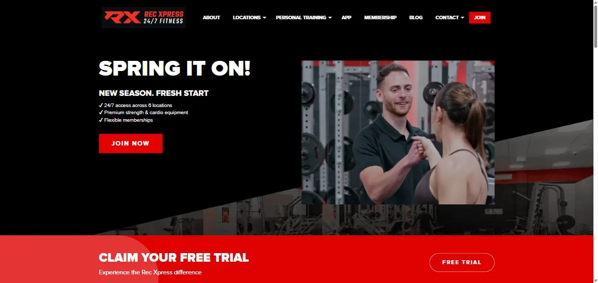
Rec Xpress today. The benefits a prospective member cares about are in the first screen, with a single action and a free trial offer directly underneath.
The rebuilt page answered the objections before they were raised. Night owl? Open 24/7. Tight budget? Low weekly price shown up front. Live far from one branch? Six locations. Hate contracts and joining fees? None. The images showed the aspirational version of the visitor, fit and energised, rather than equipment.
Those changes produced a 150% increase in organic conversions, a 35% increase in organic traffic and a 104% increase in Google Ads conversions, which you can read in full in the Rec Xpress case study.
How to build customer empathy quickly
Talk to the people you want more of, one at a time. The questions that produce usable answers:
| Ask prospects | Ask existing customers |
|---|---|
| What do you hate about [this kind of service]? | If my service were a worker, what job did you hire it for? |
| Describe the last time this problem got bad enough to do something about | How is your life better because of it? Be specific |
| What happens if you do not solve it? | What did you use before, and what was wrong with it? |
| What is wrong with the solutions you have tried? | What nearly stopped you from choosing us? |
| Describe your ideal solution, and why | What would you tell a friend in your situation? |
Put the answers into a customer empathy map, one per profile. A hotel might have three: the mother planning a family holiday, the groom booking a honeymoon, the executive assistant booking a private suite for her boss. Their priorities barely overlap, and a page written for all three speaks to none.
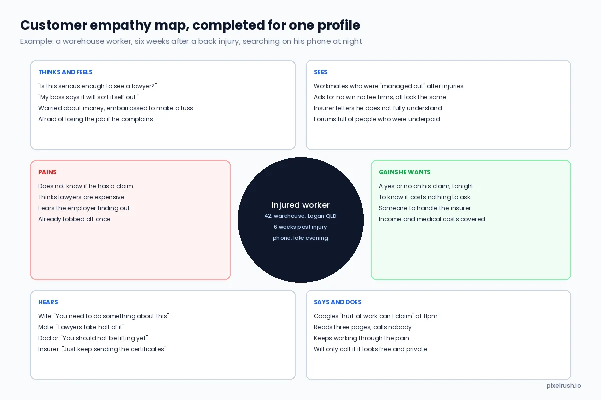
A completed map for one personal injury profile. Every line on it turns into a headline, a bullet or an objection answered on the page.
Then use the map to remove two things from the page: anxiety, the psychological discomfort a visitor feels, and friction, anything that slows them down or makes the task harder. That is what landing page optimisation is, underneath the design.
Lesson 2: Make sure everything works before you optimise anything
Testing whether the page actually functions is the lowest-hanging fruit in conversion work, and it is skipped constantly, because the basics are boring.
Load speed is the obvious one. Portent's research puts the drop at around 4.4% in conversion rate for every extra second of load time in the first five seconds, and Google has used page speed as a ranking signal for years. It also feeds the landing page experience component of Quality Score, which our Quality Score guide covers in detail. In practice the causes on service business sites are nearly always the same: oversized images, a bloated theme with a page builder, no caching, cheap hosting and a pile of third-party scripts nobody uses.
Mobile is the other. Most people now reach a service business from a phone, often at a bad moment, and a page that was designed on a 27-inch monitor and squeezed onto a phone screen is where a large share of paid traffic dies.
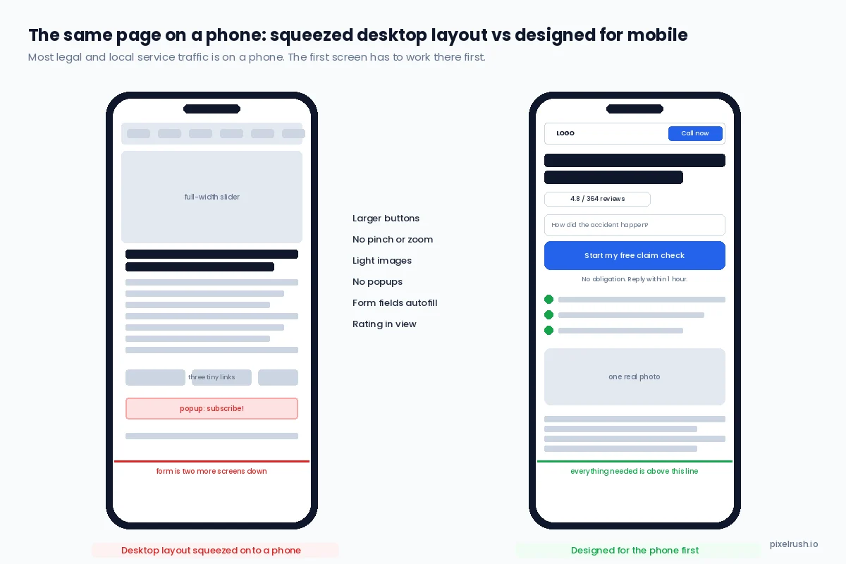
The same page twice. On the left, overlapping elements, unreadable text, three links you cannot tap without hitting the wrong one, and a form two screens away. On the right, everything the visitor needs before the fold.
Great Southern Sunnies is a good example of a site that handles this properly. On desktop the first screen carries the offer and two clear actions. On a phone the layout rearranges so the same actions sit above the fold rather than being pushed down by a full-width image, and the brand logos they stock, which are the trust signal for an eyewear buyer, stay in view.
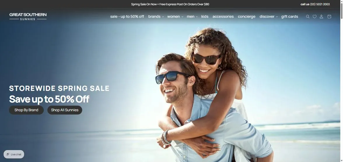
Desktop first screen: one offer, two actions, nothing competing. The mobile version keeps the same priority order instead of stacking the image on top.
Mobile optimisation is more than compressing the desktop layout. Some elements change completely. The checklist we apply:
Lesson 3: Relevance decides more than design
When a visitor lands, they ask three questions in under five seconds: am I in the right place, what is this and is it for me, and is there any reason to keep going. Fail any of them and they leave.
Relevance fails in three ways. The page appeals to the wrong motivation: the visitor cares about quality and the page is shouting about speed. There is no continuity: the ad promised "divorce lawyer for complex, high-value matters in Melbourne" and those words are nowhere on the page, so the visitor feels disoriented. Or there is simply too much noise, and nothing on the page is emphasised, so nothing is seen.
Case study: decluttering took conversion from 3% to 8%
The page below belonged to a psychology practice. Look at it as a prospective client would.
Before the rebuild, the first screen had a video, a newsletter sign-up, a second video about why people loved the practice, a vague "your pathway to happiness" headline, an unreadable testimonial, a wall of text listing every condition they treated, and no clear way to claim the free session the copy mentioned. Do you call? Fill in a form? It did not say.
When visitors are given too many choices they often make none; multiple competing offers on a page measurably reduce conversions, and that page was the textbook case.
What we changed:
| Change | Why |
|---|---|
| Stripped the first screen back to one purpose: book the free session | Nothing else competed for attention |
| Replaced the vague headline with a concrete outcome | "Your pathway to happiness" could describe a puppy. It created questions, not answers |
| Added video testimonials and "as seen on" logos together | Trust built fast, near the action |
| Made the offer risk-free and said so | The guarantee removed the main hesitation |
| One yellow button and a yellow phone number in a sea of blue | The eye went to the action without the page shouting |
| One calm photo with space around it, no stock collection | Matched the feeling a mental health service should give |
| Swapped images of people in distress for images of calm | Sold the outcome rather than the problem |
Conversion rate went from 3% to 8%, and leads from 30 to 60 a month, on the same traffic. Nothing changed in the ad account.
Key Point
Visitors decide whether they are in the right place within five seconds. The headline, the first image and the first button carry that decision. Everything else on the page is for the people who have already decided to stay.
Lesson 4: A real unique value proposition decides the comparison
Once relevance is established, the next question in the visitor's head is "why you?" Unless what you sell is cheap enough to be an impulse, they are comparing you to two other tabs. They read reviews, they check competitors, in B2B they build spreadsheets.
Your unique value proposition is your answer to "why should I buy from you instead of them?" Most businesses do not have one, or have one so generic it could be anyone's.
| Weak | Working |
|---|---|
| "We offer breakfast, lunch and dinner." | "After touring the organic farm, eat a three-course lunch cooked from what you just walked past, under the fig trees." |
| "Website design services." | "Websites built to convert paid traffic, measured by enquiries, not by how they look in a portfolio." |
| "Experienced personal injury lawyers." | "Free claim check in 60 seconds. No win, no fee. Over 99% of our claims succeed." |
| "Quality gym with great facilities." | "$0 joining fee, no lock-in contract, open 24/7, six locations." |
When I work with clients on their pages, the first draft is always "we care about our customers" and "we provide high quality". It is only when I name a competitor and ask why I should go to them instead that the real reasons come out, in a rush, and that is the content that belongs on the page.
Greenlight Environmental Services, an occupational hygiene and hazardous materials consultancy, is the example. Their original homepage had a call to action but gave no reason to use it and did not explain the problems they solve.
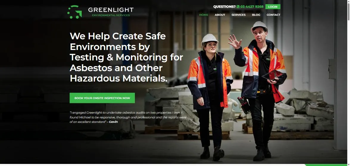
After the rebuild, and still live today: the headline says exactly what they do and for whom, the button says what happens next, the proof sits directly under it, and the photo is their own team on a real job.
The rebuilt page states the service in one sentence, lists the problems they solve so a visitor recognises their own, puts a testimonial under the green button and uses photographs of the actual staff. There is not a stock photo on the site. Rec Xpress did the same thing with a list of reasons that most gyms do not offer: no joining fee, 24/7, no contracts. Exclusivity is what gives a visitor a reason to act now rather than keep shopping.
Writing a value proposition that holds up
Do:
- Lead with what matches the visitor's top pain. Perfume sold in small bottles outsold big ones once people could carry them; "big" was never the value.
- Frame a weakness as the advantage it is. A small firm is faster, more personal and more flexible than the national brand. Avis built a whole brand on being number two.
- Use the words customers use. Read your reviews and complaints. If "easy to deal with", "fast response" and "they just handled it" keep appearing, those are your value proposition, not whatever the agency wrote.
- Show the concrete result. If you have numbers, put them in the first screen.
Do not:
- Use jargon the visitor has to decode.
- Write a slogan and call it a value proposition. "Just do it" is a brand line, not a reason to choose.
- Be vague. A bland but specific statement beats a clever ambiguous one.
- Make a claim you cannot back up. Every claim on the page should be followed by proof, which brings us to the next lesson.
Lesson 5: No credibility, no conversion
In a stone arch, the keystone is the piece that locks everything else in place. Credibility is the keystone of a landing page. You can have a fair price, a sharp value proposition and a bright button with an arrow pointing at it, and if the visitor does not trust you, none of it matters. People are sceptical by default, and a visitor from a paid ad is more sceptical than most.
What builds trust on a page, in roughly the order it works:
| Trust signal | How to use it | Watch out for |
|---|---|---|
| Video testimonials | One or two real clients, 60 to 90 seconds, near the action | Over-produced, scripted delivery reads as fake |
| Client or partner logos | A row under the first screen, only recognisable ones | Logos nobody knows add nothing |
| Reviews with a count and a rating | In or directly under the hero | Fake-looking perfection; prospects know what bought reviews look like |
| Guarantees | Bold and uncommon for your industry, next to the button | A guarantee buried in the footer does nothing |
| Case studies with specific numbers | Story plus figures, linked from the page | Vague "great results" claims |
| Real photos of real people | Staff, premises, work in progress | Stock photos signal there is nobody behind the business |
| Address, phone number, named people | Visible, not hidden on a contact page | Anonymous businesses do not get called |
| Demonstrated expertise | Teaching, speaking, video, a free audit | Claiming expertise without showing it |
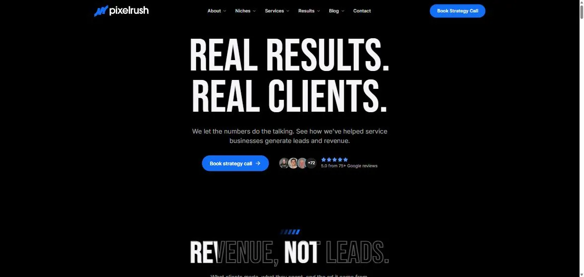
We apply it to ourselves: rating and review count beside the button, and case studies that state what the client made, what they spent and where it came from.
A note on reviews. Because faked reviews are now common, visitors are more suspicious of anything that sounds too good. Specific, slightly imperfect, verifiable reviews outperform glowing generic ones. Our article on why a 4.4-star rating is hurting your ad performance covers how the rating itself follows you into the ad and the page.
The credibility killers are the mirror image: a dated design next to a competitor's polished one, "world-class" claims with nothing behind them, aggressive sales copy, spelling errors, a shabby refund policy, and a price so low it reads as a warning.
Lesson 6: Make the call to action clear, prominent and well-timed
A clear, unmissable call to action in the right place at the right moment does more for conversion than almost any other single element. The job of the button is to look like the path to what the visitor wants.
Fitzroy Island Resort is the first example. The original homepage opened with a full-screen image and nothing else. Visitors had to scroll to the middle of the page to find a small "Book Online" button, and before that the page had given them no reason to book.
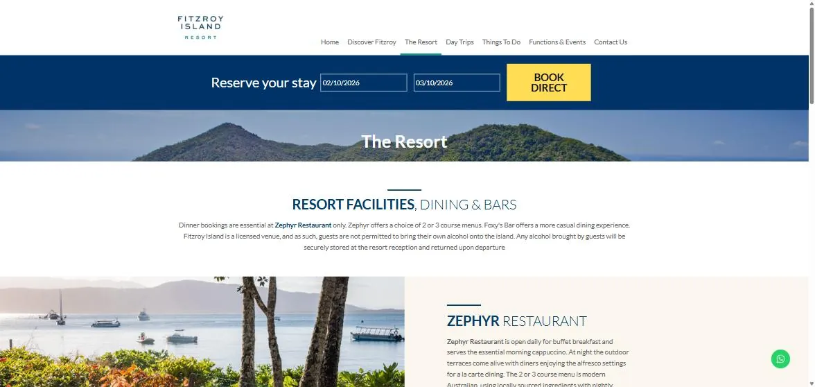
Fitzroy Island today: the booking action, with dates, travels with the visitor on every page, and "book direct" is the reason to use it rather than a booking site.
The rebuilt page led with imagery that showed what you get, a play-video element as one of the first things you see, social proof, a "best rates guaranteed when you book direct" reason to act, a prominent booking button and the ability to set dates on the spot. Direct booking revenue rose 60%, which for a resort of that size was a five-figure monthly number. The full story is in the Fitzroy Island case study.
Bundaberg Emergency Animal Hospital is the second. The old page emphasised the phone number at the top but had no call to action anywhere a panicked pet owner would look.
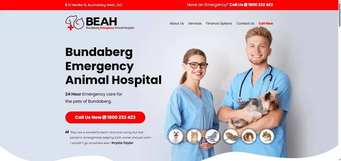
An emergency vet has one job on the page: get the phone ringing. The number is in the top bar, in the headline area as a button, and in the navigation. The testimonial under the button answers the "are they any good" question before it is asked.
Sometimes the problem is too many calls to action rather than none. Sugarland Animal Hospital's original page had several, all weighted equally, so none stood out, and the hero image showed a dog that looked unwell, which emphasised the problem rather than the outcome.
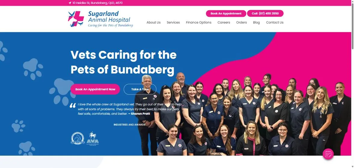
Two actions, one primary and one subdued, a testimonial underneath, and a photo of the whole team with the industry logos beneath it. The image sells the outcome: a well-run practice full of people who like their job.
| Call to action | Do | Do not |
|---|---|---|
| Size and contrast | Big, bold, one colour reserved for actions | Blend it into the background |
| Copy | Say what they get: "Start your free trial", "Book your free 20-minute consultation" | "Submit", "Enter", "Click here" |
| Placement | First screen, then repeated down the page with the same wording | One button at the bottom |
| Timing | After the reason to act, not before | Ask before you have given a reason |
| Expectation | Deliver exactly what the button promised | Bait and switch |
| Number | One primary, one subdued at most | Five equally weighted buttons |
A call to action is part of a whole. The value proposition and the credibility around it are what make it compelling, and that is the reason lessons 4 and 5 come first.
Lesson 7: Track the right conversions, properly, or you know nothing
Setting up the right conversion goals is what turns an account from guesswork into something you can improve. Visitors are not one group. Some are on phones, some on desktops, some in one suburb, some searching at 9pm. To optimise ads and pages you need to know which of those convert, which keywords are worth more spend, which days and hours convert, and how desktop compares to mobile.
If, for example, women aged 35 to 45 within eight kilometres of a postcode convert far above everyone else between 4pm and 8pm, you can shift budget to them and away from the segments that never convert. Without that data you are spending on everyone and everything equally.
Most businesses get this wrong in one of two ways: they do not set up conversion tracking at all, or they set it up so loosely that it produces noise. It is the most expensive of the Google Ads mistakes we audit for, because every other decision in the account depends on it. The classic version is tracking a thank-you page view as the conversion. Ten "conversions" come in, and you have no idea whether they were purchases, sign-ups, form enquiries or phone calls, so you cannot bid differently for any of them.
Here is what that looks like in a real account. The Google Ads dashboard reported 761 conversions for the month. Split by conversion action, the number stops being one number:
| Conversion action | Conversions | Share of the 761 | What it is worth, and what to do |
|---|---|---|---|
| Online purchases | 481 | 63% | Real revenue. These are the ones to bid for |
| Account sign-ups | 94 | 12% | Worth something, worth less than a sale. Give them a lower value so the algorithm does not chase them |
| Contact form enquiries | 15 | 2% | The highest value action per unit in a service business, drowned out by the volume above |
| Calls from the website | 2 | 0.3% | Almost certainly under-tracked. Two calls a month from a site this size means call tracking is not set up |
| Page views, scrolls and other actions | 170 | 22% | Not conversions. Remove them from the conversion column or Google optimises toward them |
Counted as one number, the bidding algorithm optimises for whatever is easiest to produce, which is usually the cheapest action: here, page views and sign-ups. Split out, with a value on each action, the account bids toward purchases and enquiries and stops paying for scrolls. The fractional counts you see in your own account come from Google attributing a conversion across several ad interactions.
The conversion actions that should exist in a service business account, each tracked separately:
- Contact form enquiry, fired on the thank-you page
- Phone calls from ads, with a minimum duration
- Calls from the website, through call tracking
- Click-to-call taps on mobile
- Bookings or transactions, with a value
- Sign-ups, with a lower value
Once each action has its own value, you can bid towards the ones that make money and stop paying for the ones that do not, and you can check the segments by device, location and time with real numbers behind them. Look at 30, 60 and 90 day windows rather than a week, so seasonality does not fool you.
Beyond this sits the work that separates a well-run account from the rest: Google Tag Manager, call tracking, form tracking as events, and pushing every enquiry into a CRM with its source so you can see which ones became customers. Our guide to structuring PPC campaigns that convert walks through that layer for law firms. That last step is what our whole closed loop system is built around, and it is covered in our article on why your law firm's Google Ads leads are junk, which applies to every service business.
The checklist to run on your own landing page
Open the page your ads send traffic to, on your phone, and go through these in order.
| # | Check | Lesson |
|---|---|---|
| 1 | Does the headline say what the visitor gets and who it is for, in the words they searched? | 3, 4 |
| 2 | Does the page match the ad's promise word for word? | 3 |
| 3 | Is there one obvious action in the first screen, and is it a button? | 6 |
| 4 | Is there a rating, testimonial or logo row within the first screen? | 5 |
| 5 | Does the page answer the visitor's main objection before the form? | 1, 4 |
| 6 | Is there anything on the page that is not helping the conversion? Menus, social icons, second offers, sliders | 3 |
| 7 | Are the photos of your actual people and premises? | 5 |
| 8 | Does it load in under three seconds on mobile data? | 2 |
| 9 | Can every element be read and tapped on a phone without zooming? | 2 |
| 10 | Does the form ask only what you need to have the first conversation? | 6 |
| 11 | Is every conversion action tracked separately, with calls included? | 7 |
| 12 | Do you know what the visitor was worried about before you built any of it? | 1 |
Fix the first "no" you hit, leave it for a few weeks, and check the numbers, with calls and forms verified rather than assumed. Then take the next one. The psychology practice above did not need twelve changes to go from 3% to 8%; it needed the first five done properly.
A well-built landing page improves your Google Ads Quality Score, lowers your cost per acquisition, lifts your conversion rate and raises return on ad spend, all from the same traffic. It is the cheapest improvement in the whole account, and it is the one most businesses never make.
If you would rather have us look at yours, we review the page alongside the campaign as part of our Google Ads and Meta Ads management, with the case studies above as the standard we work to. Book a call and bring the page.
Want us to implement these strategies for you?
Book a free strategy call and let's discuss how we can grow your business.
Book Your Free CallContinue reading
More on Paid Ads
Is Google Ads Worth It? What $7 Million of Spend Says, and When It Isn't
Google Ads is worth it when a client is worth more than it costs to buy one, and most businesses asking the question cannot fill in either number. What a click, an enquiry and a client cost by industry across $1.65 million of recent Australian spend, the break-even maths with three worked examples, the five situations where it is not worth running, what $10 a day actually buys, and how to know in 30 days.
Google Ads Management Costs in Australia, and What the Fee Actually Buys
What Australian agencies and freelancers really charge to manage Google Ads, the three pricing models compared, how many hours a fee actually funds, and how to tell whether you are overpaying.
10 Questions to Ask Before You Hire a PPC Agency or Freelancer
The ten questions that separate an agency that will do the work from one that pitches well, what a good answer actually sounds like, the red flags in each, and a scoring sheet you can use across three agencies.
Costly Google Ads Mistakes Small Businesses Make in 2026 (and How to Audit for Them)
The mistakes that actually drain small business Google Ads budgets, what each one costs, how to check for it in your own account, and the AI prompts that let a non-specialist run the same checks accurately.